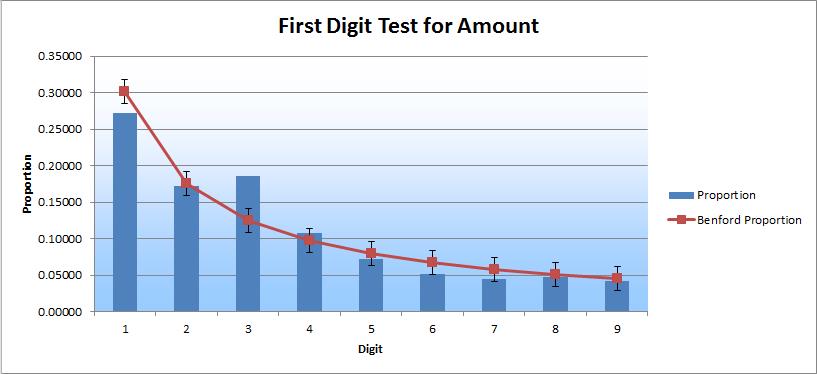
As you can see, the 3-digit column sticks out and is high relative to the Benford curve for both charts. The 2-digit column sticks out as well and is relatively high, but only in the second chart. These results prompted me to drill down into each of the three columns.
I began to analyze the subsets of data and found that certain vendors had an unusual volume of checks written to them; several vendors had 200 or more checks written to them over this period of time. The other thing I quickly noticed was that many of the vendors with these high volumes had “do not use” included in the vendor name field. That seemed very unusual. I typically expect that this kind of label would be a signal to not use that vendor and that it would also hopefully lead to the eventual removal of that vendor from the master list.
With these two questions in front of me, I continued digging. Next, I looked at the greater population of checks to see how much total volume was written to these “do not use” vendors over the years. What I found was absolutely staggering.
A single vendor, in a population of more than 16,000 checks spanning a period of 10 years, had over 1,400 checks written to them over a period of just three years. Nearly 10 percent of the total checks were written to this single vendor, in just one-third of the time. The other entity had more than 1,700 checks written to one vendor over a period of five years. How is that possible? That doesn’t just happen naturally in most businesses. There must be some other reason.
Unfortunately, I am not in a position to share the end results. But, I can say that it led to further investigation, which is the point of Benford’s Law. In and of itself, a Benford’s Law analysis will not produce a smoking gun, but it will shine a light on the cloud of smoke, and if you follow that cloud of smoke, you might find the smoking gun. This is a fine example of the process in action.


